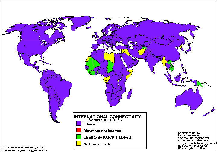
Statistical Map
Statistical maps are maps in which the variation in different factors are shown. The factors can be anything from rainfall to population of the world. This map shows the international connectivity around the world. The purple shows the countries that depend mainly on the internet, while the red shows the countries that use bitnet. The green shows countries that use email only, while the yellow countries have no connectivity. Most countries use the internet because they are shown with purple.
Parallel Coordinate Map
Parallel coordinate maps uses high-dimensional geometry to analyze data being studied. The back has parallel lines drawn while the figures are shown in the front of the parallel lines. Each parallel line represents a certain factor and each line drawn in front is a different characteristic within the variable. In this map, quarterbacks for different football teams are shown with the red line being Garrard and the blue line being Roethlisberger. Each quarterback has his statistics shown and compared on the same graph.
Population Profile Map
Population profile maps are those that show an overview of demographic statistics in the census in the United States. This map shows Florida with the dark blue colors show the higher population. Besides the large picture of Florida, the map also includes a racial pie chart, a population pyramid, and a housing occupancy rates bar chart. All of this information together represents what is taken in each census. This information was taken from the 2000 census.
Unclassed Choropleth Map
Unclassed choropleth maps are those that have an equal number of categories data variables. Values are shown on a color scale based on the percentage of the variable being measured. For example, the darker colors would have a higher percentage than the lighter colors. This map minimized generalization that might be created. In this map, the population is shown with the darker areas representing the more populated areas in the United States.
Classed Choropleth Map
Classed chorpleth maps are a type of choropleth map that shows the color intensity for the map shown. This map shows the homocide rates for males in the United States for 2001-2005. The states are all divided into red, blue, and gray colors representing homocide rates within each. The blue states show a low chance of it happening, while the red states show a high rate of it. The gray states are in the middle.
Windrose Map
Windrose maps are maps that measure the speed and direction of wind in particular areas. Using a grid, the frequency of wind over time is measured and put onto the graph. In this map, the different colors show the difference in wind speed. The red shows the largest amount of wind speed with 11-17 knots, and the yellow area shows the lowest amount of wind speed with only 1-4 knots. Also shown in this map is the direction of the wind as well. In this map, there is more wind on the west side than there is on the east side.
Unstandardized Choropleth Map URL
Unstandardized choropleth maps are a type of choropleth map that does not distinguish things based on a ranking system. For example, one color does not mean it is better than another color, it just means it is different. In this map of Afghanistan, the colors show the different languages that are dominant in that area. Unlike standardized choropleth maps, it does not represent colors based on levels, just different categories. This map shows that the two most dominant languages spoken are Pershian and Pashto.


