Sunday, July 17, 2011

Statistical Map

Statistical Map
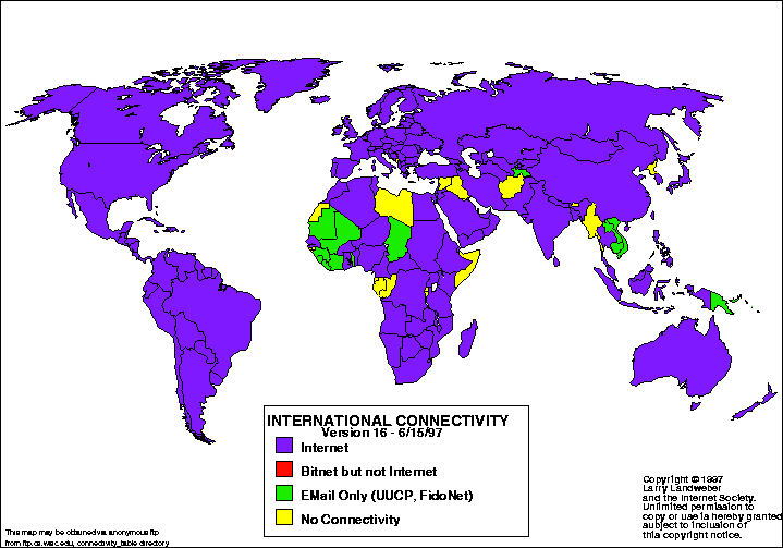
Statistical maps are maps in which the variation in different factors are shown.  The factors can be anything from rainfall to population of the world.  This map shows the international connectivity around the world.  The purple shows the countries that depend mainly on the internet, while the red shows the countries that use bitnet.  The green shows countries that use email only, while the yellow countries have no connectivity.  Most countries use the internet because they are shown with purple. 

Parallel Coordinate Map

Parallel Coordinate Map

Parallel coordinate maps uses high-dimensional geometry to analyze data being studied.  The back has parallel lines drawn while the figures are shown in the front of the parallel lines.  Each parallel line represents a certain factor and each line drawn in front is a different characteristic within the variable.  In this map, quarterbacks for different football teams are shown with the red line being Garrard and the blue line being Roethlisberger.  Each quarterback has his statistics shown and compared on the same graph.

Population Profile Map

Population Profile Map
Population profile maps are those that show an overview of demographic statistics in the census in the United States.  This map shows Florida with the dark blue colors show the higher population.  Besides the large picture of Florida, the map also includes a racial pie chart, a population pyramid, and a housing occupancy rates bar chart.  All of this information together represents what is taken in each census.  This information was taken from the 2000 census. 

Unclassed Choropleth Map

Unclassed Choropleth Map
Unclassed choropleth maps are those that have an equal number of categories data variables.  Values are shown on a color scale based on the percentage of the variable being measured.  For example, the darker colors would have a higher percentage than the lighter colors.  This map minimized generalization that might be created.  In this map, the population is shown with the darker areas representing the more populated areas in the United States.

Classed Choropleth Map

Classed Choropleth Map
Classed chorpleth maps are a type of choropleth map that shows the color intensity for the map shown.  This map shows the homocide rates for males in the United States for 2001-2005.  The states are all divided into red, blue, and gray colors representing homocide rates within each.  The blue states show a low chance of it happening, while the red states show a high rate of it.  The gray states are in the middle. 

Windrose Map

Windrose Map
Windrose maps are maps that measure the speed and direction of wind in particular areas.  Using a grid, the frequency of wind over time is measured and put onto the graph.  In this map, the different colors show the difference in wind speed.  The red shows the largest amount of wind speed with 11-17 knots, and the yellow area shows the lowest amount of wind speed with only 1-4 knots.  Also shown in this map is the direction of the wind as well.  In this map, there is more wind on the west side than there is on the east side.

Thursday, July 14, 2011

Unstandardized Choropleth Map

Unstandardized Choropleth Map URL
Unstandardized choropleth maps are a type of choropleth map that does not distinguish things based on a ranking system.  For example, one color does not mean it is better than another color, it just means it is different.  In this map of Afghanistan, the colors show the different languages that are dominant in that area.  Unlike standardized choropleth maps, it does not represent colors based on levels, just different categories.  This map shows that the two most dominant languages spoken are Pershian and Pashto.

Standardized Choropleth Map

Standardized Choropleth Map URL
Standardized choropleth maps are a type of choropleth map that standardizes the information according to a certain area.  In the map above, the areas are standardized together so it is easy to see the different colors represented with the different areas.  Population per square kilometer is shown with the darker colors showing the more populated areas.  Since it is standardized, focusing in on the more populated areas is easier. 

Flow Map

Flow Map URL
Flow maps are a type of cartography map that combines flow charts with maps.  In this map, migration is followed between different continents and countries.  It shows a large migration coming from Europe to all other parts of the world.  Many went to either South America or North America.  Flow charts show the movement of objects to a certain place, and it this case they are measuring people migrating.  It does not show each country and has some distortion. 

Propaganda Map

Propaganda Map URL
Propaganda maps are used to try and persuade people's opinion of a certain reason.  Most places use maps like these in order to make their region better than another region.  In this map, Great Britian is showing how they own over one-fourth of the world's land, and Germany barely has any land.  This map was used during the war to show people why they should be on the British side and not the German side.  The British used propaganda to persuade people of why they are better. 

Monday, July 11, 2011

Proportional Circle Map

Proportional Circle Map URL
Proportional circle maps show data in relation to the size of the circles.  There are different sizes of circles which show the variation in what is being measured.  This map shows the number of people killed in Europe in 2000 caused by road accidents.  The smallest circle shows 100 deaths and the largest circle shows 8000 deaths.  Places like Norway and Sweeden had a very small amount of deaths in the year 2000.  On the other hand, France and Germany had a very large amount of deaths during that year. 

Dot Density Map

Dot Density Map
Dot density maps show the distribution of people for a certain variable.  In this map, each dot represents 200 people living in a nonmetro county.  The darker areas on the map show the higher amount of poor people living in the area.  The areas where there is mostly white colors shows where there are not very many poor people.  This distribution is taken from the year 2004 in the United States. 

Population Pyramid

Population Pyramid URL
Population pyramids show the sex and age of the population for a certain place.  The difference in distribution will be seen depending on what region the information is received from.  In this graph, the population in Sudan for the year 1995 is shown.  Females are located on the right side and males are on the left side.  The x-axis shows the population in thousands of both sexes, and the y-axis shows the age of both sexes.  From this map, it is easy to see that once a child is born, his or her change of surviving decreases every year.  There are many more children age 0-4 than there are people over 60.  This could mean there is a third variable creating these population changes. 

Bilateral Graph

Bilateral Graph URL
Bilateral graphs compare two related variables that overlap one another.  In this graph, the blue line depicts the annual population change in the world in 2009, and the red line shows the world's population in 2010.  On the left side of the graph, the population on 2010 is still increasing.  The two lines cross at the beginning and the values change.  The right side, on the other hand, shows the population in 2009 decreasing.  Where the two lines overlap is where the increase in variables changes. 

Line Graph

Line Graph URL
Line graphs are a type of geovisualization where data is designed with dots connected by lines.  The trend line averages all the data creating an easier way to view it.  In this graph, minimum wage is measured over a 70 year period.  The graph shows that minimum wage has slightly incresed every ten years.  In 196, the minimum wage was only one dollar, but in 2000, it was over five dollars.  Line graphs are an easy way to compare data over a certain amount of time.

Portolan Chart Maps

Portolan Chart Map URL
Portolan chart maps were made and used by mariners.  This map uses lines of compass direction to show the coastlines of particular areas.  It allows fishermen to navigate to farther locations and find places where fishing may be the best.  The area on the coast had more detail than the inland area because the map was made for the waters near the coasts.  The land inside the coasts was still unknown to the fishermen navigating the areas because that information was not necessary for them to know at that time.

Stick Chart Map

Stick Chart Map URL
Stick charts were first used by tribes in the Pacific Islands.  It uses sticks to make certain patterns in order to either show a location of something or explain how to do something.  People had to understand the formation of the sticks in relation to the ocean currents and waves.  Each tribe called these pictures something different, but they all used the for the same type of stuff. 

Mental Map

Mental Map URL

Mental maps show people's personal depiction of a place.  Because of this, these maps will vary a lot between each person.  A person's point of view is measured when creating these maps.  In this map, the magazine The New Yorker shows it's view on the country.  The city of New York is shown in detail with street locations shown, but once the Hudson River is passed, the country does not have much going on.  It shows states in very small detail, which means that the rest of the country is not as populated as New York.

Cadastral Map

Cadastral Map URL
Cadastral maps were first used by the Egyptians when first dealing with their annual flooding.  They had to survey the lands before the floods came because they could not reconstruct the boundaries after the flood.  Cadastral maps show the land boundaries and ownership among a certain area.  Each cadastral map can show something different, including street names and lot numbers.  These make it easier for outsiders to be able to locate places faster because it is easier to read. 

Cosmological Map

Cosmological Map URL
Cosmological maps represented a culture's place in the cosmos, in relation to religion or mythology.  This map is called the Codex Fejervary and was used by the Aztecs in the 14th-16th centuries.  This map showed the Aztec's world in five different directions, North, South, East, West, and Central.  This was put into the Aztec's calendar and followed religiously.  This was just one of many diferent kinds of cosmological maps.  Each different group of people had a type of cosmological map for themselves. 

Human Genome Map

Human Genome Map URL
Human Genome maps are a type of cardiographic visualization that shows the genome of the Homo sapiens.  There are 23 pairs of chromosomes on the DNA.  22 of the pairs are autosomal chromosomes, which are used to determine characteristics not related to sex.  The last pair are the sex determining chromosomes.  It can either have two Xs, which represent females, or an X and a Y  which relate to males.  Human genome maps are used for many different reasons.  They can be used to see if the person has a certain disease that may be passed to the offspring.

Digital Map

Digital Map URL
Digital maps shows how data is represented to the virtual image.  These give acurate showings of certain areas.  During the 20th century, mapping switched from paper to computer drawings.  This made it easier to make maps with the help of the computer, but it did not always mean they were very acurate.  This map allowed people to calculate distances easier with the help of computers.  Many places on the internet can help someone create a map at ease.

Geodesic Map

Geodesic Map URL
Geodesic maps measure the shape and size of the Earth.  This was first established by Eratosthenes when he was working on the circumference of the Earth.  In 1866, North America was measured by Clarke's Ellipsoid.  This later became the standard for the North American Datum 1927 (NAD27).  This map shows the world and the distances between places.  It also shows the best represented size for its kind of map.  GPS units still rely on this type of mapping today.

Thematic Map

Thematic Map URL
Thematic maps use different themese among places.  The first widespread use of thematic maps were developed in France in the mid 1700's.  Themes for each map can differ for each geographical location.  It can be anything from social, economical, or physical qualities.  The theme of this map is related to political parties in the United States.  This shows each state in the continental United States and which party the state is affiliated with during the Governors' Office in January 2007.  Florida, New York, and California all have Republican Governors.  On the other hand, Louisiana, Washington, and Pennsylvania all had Democratic Governors. 

Triangulation Maps

Triangulation Map URL
Triangulation maps measure the distance between landmarks.  The French cartographer, Cassini, initiated the first national-scale mappings in France in the middle of the 18th centrury.  This was what he used to measure distances.  In this map, people are located at point A and point B and something is in the distance, located with the star.  S is the distance between both the people.  The base angles at points A and B can be measured by a theodolite.  Since the distance at S is known, the distance of D can be calculated as well.

Waldseemüller Map

Waldseemüller Map URL

Waldseemuller maps were created in 1507 and show the findings of Christopher Columbus and Amerigo Vespucci.  The findings of Christopher Columbus were in middle America and those of Amerigo Vespucci were in South America.  It was the first map to show the outlines of America with the whole Pacific ocean.  The creater of these maps, Martin Waldseemuller,  showed that America was separate from Asia, which was different during this time. 

Ecclesiastical Maps

Ecclesiastical Map URL
Ecclesiastical maps are those made in Europe during the Middle Ages that showed location based on churches and religion and not science.  This map is inside Rome showing the churches in the Vatican.  Since this period in time was ruled by religion, these maps were very common to find.  Maps were also made of Heaven to show the myths and use propaganda to make people go to the churches.  These maps were ornamental and took a long time to create just one map.

T-O Map

T-O Map URL
T-O maps are a type of mappaemundi that was created during the Middle Ages.  It only shows three continents, Asia, Europe, and Africa.  This map shows only the reachable sides of the round Earth, since they thought no one would dare to cross the lines into other locations.  In this map, Asia is located in the top half, and the bottom half is divided in half with Europe on the bottom left and Africa on the bottom right.  The Mediterranean Sea is separating Europe and Africa and the Red Sea is separating Asia from Africa. 

Aboriginal Painting Map

Aboriginal Painting Map URL

Like stated in the powerpoints, Aboriginal paintings are considered maps.  This map has myth of the formation but it can also be portraying the physical land and objects within it.  Songlines in the map are shown, which are used when passing through the land or through the land of another tribe.  Some of the songlines are the same between tribes, but many differ as well.  Landscape features, animals and plants, and formation myths are all put together in creating songlines. 

Tuesday, July 5, 2011

PLSS Map

PLSS Map URL
The Public Land Survey System divides the land of the United States.  PLSS is a systematic land partitioning system.  The township shows the horizontal lines that are six miles apart.  The range shows the vertical lines that are six miles apart.  In this map of Minnesota, each congressional township is divided into 36 one-mile squared areas called sections.  Each section contains about 640 acres.  Each section on the map above has a number that represents its location. 

Monday, July 4, 2011

Bivariate Choropleth Map

Bivariate Choropleth Map URL
Bivariate choropleth maps are those that compare two different sets of data in one map.  The two variables on a single map are represented by colors or symbols.  This is a type of choropleth map.  In this example, the color for each couty is the total population of people.  The lighter colors show the smaller populations and the darker colors show the counties that are more populated.  Since bivariate choropleth maps have two different variables, other variable is average house value for the area. 

Univariate Choropleth Map

Univariate Choropleth Map URL
Univariate choropleth maps are maps that show a single data set.  Only one set of data is shown in this map of the United States.  Auckland, New Zealand is shown in the map above.  This map shows the percentage of Pacific Islanders in each area during the census.  Only one variable is shown in this type of map. The darker red colors show more Pacific Islanders and the lighter blue colors show a lower amount of Pacific Islanders.

Cartogram Map

Cartogram Map URL
Cartogram maps are a type of thematic map that exaggerates things based on a certain variable.  The space and size of the map is distorted in order to show information about places.  In this map, countries are shown in relation to how much wealth it has.  It is easy to see that countries like the United States, Japan, and Great Britain are very wealthy compared to the population.  The countries of Africa, on the other hand, are so tiny compared to their population which means that Africa is a very poor continent.  This shows that the wealth in the world is definitely not equal among each country.

Choropleth Map

Choropleth Map URL
Choropleth maps are thematic maps that show areal data by showing different colors.  They are usually divided by things such as countries, states, or census tracts.  Most are areally averaged by percentages or densities.  In this map of Africa, life expectancy is measured in each country.  It is divided by country because it makes it easier to compare them to one another.  This map shows that no countries in Africa have a life expectancy that exceeds 73 years.  Many of the developing countries have lower life expectancy and this map shows an easy way to compare them. 

Climograph Map

Climograph Map URL
Climograph maps show two different things in one.  It shows the annual precipitation for each month along with the average temperature for the whole year in a particular place.  The bars represent the precipitation for the month, while the line shows the temperature for the year.  This graph was taken in the northern hemisphere because the highest temperature is during the summer months of June, July, and August.  In this map, the months of June and July experienced the most rain and the highest temperatures.  November and December had the smallest amount of rain for the whole year.  This map was taken from Colorado.

Hypsometric Map

Hypsometric Map URL
Hypsometric maps are surface maps with that show relief.  Third dimensional information is represented and it may be color and shaping, contour lines, or raised relief.  In this map of southern California, relief is shown in order to see the difference in elevation.  The green colors are where the land has the smallest elevation, or is flat.  The lighter colors on the map show that there is a change in elevation as one would travel inside the state more.  Hypsometric maps don't have to show relief; it can be any other process that superimposes on the surface.  In this case, it is elevation relief that is shown. 

Sunday, July 3, 2011

DOQQ Map

DOQQ Map URL
Digital Orthographic Quarter-Quads combine the characteristics of an aerial photograph, which is a picture taken by a camera mounted on the bottom of an airplane.  It has been georeferenced and orthorectified.  They are then used as flat maps by removing the distortion from the aerial pictures.  This type of pictures can represent some features more than others.  The features at higher elevations will be seen in better detail because they are closer to the camera.  This map shows the overview of a waterway through the land in Louisiana. 

DEM Map

DEM Map URL
Digital Elevation Models are digital files consisting of terrain elevations for ground positions at regularly spaced horizontal intervals.  It involved the raster format and the cartographic data is recorded, stored, and processed in a cell, or pixel.  They can also be used to generate three-dimensional images or colorized to bring out relief.  These maps are used a lot when trying to show the three dimensions of a planet or moon.  In this map, the land form shows its different elevations in the third-dimensional form over the Sahara Desert. 

DLG Map

DLG Map URL
Digital line graphs are maps that contain a variety of different information such as boundary lines, roads, and other topography.  This is digital vector data because data about map features are stored as lines, points, and areas.  This type of map is also from the United States Geological Survey.  The different scales present allow the map to portray a variety of information.  In this map, state and county boundary lines are shown.  This map also has colors that could represent different things such as average temperature or elevation.

DRG Maps

DRG Map URL
Digital Raster Graphic maps are scanned images from the United States Geological Survey (USGS) topographic map.  This map is georeferenced, meaning that their features are tied into a coordinate system, a datum, and a map projection.  The raster image has border information included.  This map shows an image of the land and water areas around Michigan State University.   

Box Plots

Box Plot URL
Box plots use five different number summaries to represent the information portrayed.  The minimum number is the smallest number in the groups, and the maximum number is the largest number in the group.  The first quartile cuts off the first 25% of the data and the third quartile takes the last 25% of the data.  The median lies in the middle, but it doesn't always have to be the mean of the information.  In this graph, temperature is being measured over time.  Each of the five number summaries aren't exactly evenly distributed among the graph. 

Scatterplot Graph

Scatterplot URL

Scatterplots are graphs that use dots to represent two different variables.  The vertical axis and horizontal axis both include a set of data, and each point on the graph is the combination of the two points.  Usually, these graphs are used to experiment to see if one variable is correlated to another variable.  In this graph, for example, grip strength is being compared with arm strength.  It has a general direction of a positive correlation.  This means that generally the greater the grip strength, the greater the arm strength as well. 

Stem and Leaf Plot

Stem and Leaf Plot URL

Stem and Leaf plots are a way to map data graphically.  Information must be shown in chronological order with the stem representing the first set of numbers and the leaf side showing the last number.  For example, in this graph, infant mortality rates in Western Africa are measured showing the amount of infant deaths in each country.  The first row shows 5 on the stem side and 1 on the leaf side; this represents the number 51.  Information is graphed this way in order to see the difference in values and see if there is any outliers present. 

Histogram Map

Histogram Map URL

Histograms are graphs that show information arranged together in groups.  It shows the distribution probability of a certain variable.  The mean of the variable is in the middle of the graph with the standard deviation displayed on both sides.  In this graph, they show the average weight of people with 100 pounds being the mean.  Each standard deviation is 20 pounds in each direction.  Histogram maps show a bell curve of the probability of what is being measured, in this case it is weight. 

Isotach Map

Isotach Map URL
Isotach maps are a type of contour maps that depict windspeed.  This map shows where the wind speeds are the greatest along a certain area.  The different colors on the map show the different levels of speed of the wind.  The dark blue shows when the windspeed is greatest, and the light blue is when it is not as great.  The lines show the constant speed of wind along an interval. 

Isopach Map

Isopach Map URL

Isopach maps show the thickness of rocks or sediments.  This is a type of contour map that shows the difference in rock or sediment thickness compared to the distance.  This type of map can be used for many different uses; including knowing where drilling would be the easiest.  This is a lot like a topographic map, but instead of showing the difference in elevation, it shows the difference in the thickness of rocks.  This map shows the area in New York and Pennsylvania and where the rock is the thickest.

Isohyet Map

Isohyet Map URL

Isohyet maps show the different in precipitation over a certain land area.  In this map, an area is shown depicting its different rainfalls.  The differences in rainfall across the area can be shown by the different colors.  The red area shows when the rainfall has is the greatest, which only represents a small area.  The orange shows the next highest rainfall.  The light green shows when rainfall is at its lowest; this is seen in a greater area than the red or orange.  Isohyet maps only show the precipitation values. 

Bathymetric Map

Bathymetric Map URL

Bathymetric maps are a type of contour map that shows the difference in elevation in the sea floor.  This map shows the difference in elevation in the Gulf of Mexico.  The different colors within the ocean represent the different depths.  This map shows that the water that is closer to the shore lines isn’t as deep as it is when it’s further from land.  This map shows that the water north of Cuba is more shallow than the water south of Cuba.  It is easy to see the different depths by the colors of the water. 

Topographic Map

Topographic Map URL

Topographic maps not only show the horizontal features of a map, but the vertical features as well.  This map uses contour lines to show the relief of the land.  This two-dimensional map is able to portray three dimensions.  In this map, the natural aspects of Earth are shown through the contour lines.  The numbers on the map show the vertical change in elevation.  When the lines are closer together, the change in elevation is drastic; when they are further apart, the elevation isn’t changing as quickly. 

Planimetric Map

Planimetric Map URL

Planimetric maps are most commonly seen as street maps.  They are maps with no relief features.  These maps only show the horizontal positions, ignoring the vertical features.  It correctly shows the distance between horizontal positions, and usually shows more detail such as roads, sidewalks, and bridges.  This map shows the plans for a new city.  It includes the roads and the locations of the buildings.